Posted by schneidermike on Tuesday, May 10, 2011 ·
Last week I attended Social Loco as a speaker (thank you Mark Evans) and got to hear Ditto CEO Jyri Engstrom sit on a panel called Enabling the Users’ Revolution: from infrastructure to consumer apps. I have been following Ditto since it came out and have been wondering about how it will be used. Some call Ditto “future foursquare” where I prefer to call it “semantic twitter”.
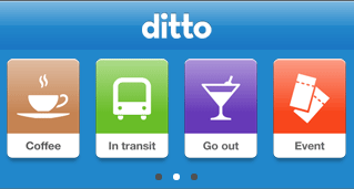
These comparisons are interesting because Ditto is an application that allows a user to announce their intent. One calls is future foursquare because it supposes that you might eventually check in someplace. I prefer semantic twitter because some of the things that you intend to do may not necessarily result in checking in, but are nonetheless very valuable. A user starts by identifying a type of activity by clicking on the “crayon box” at the top. They can then click again to refine their preferences. For instance if you want coffee, you can click the coffee icon a second time and pick that you want a latte. Others can then make suggestions about where you should go or, noticing that your location is attached to your ditto, they can decide if they would like to join you in your quest.
You can drill down from coffee to something more specific
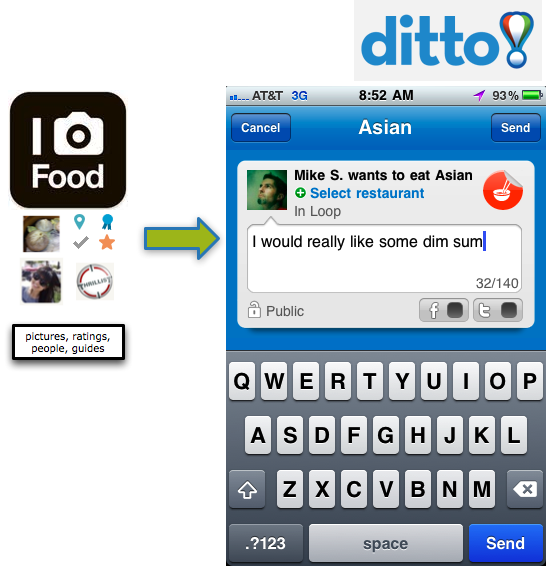
Semantic means structure. Semantic data is expressed the same way every time so that it is easy to analyze and act on. Ditto thrives on making structure easy, but even I was not prepared for what Jyri Engstrom said at social loco. He supposed that if he used Ditto to express that he wanted to go to a restaurant (and I cannot remember which kind he said, so let’s say dim sum) that someone might be able to eventually go to Foodspotting and share a dish with him.
My jaw dropped and the wheels started turning. Why is this brilliant? Sharing a dish from foodspotting is not just sharing a picture or even the name. A dish in foodspotting has a set of common attributes:
- dish name (which is standardized so that each of a certain kind of dish is nicely grouped)
- location
- 4 different rating types
- user who spotted
- guides it belongs to
- comments
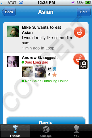
The attached data makes the suggestion far more powerful than someone just saying: “Go to Hei La Moon.” With foodspotting the person knows where to go, what people think, what the dish looks like, its exact name, other dishes at the restaurant, other spottings from that person and more.
What if you could drag the dish into Ditto?
There are endless possibilities to integrate Gowalla, foursquare, Yelp, OpenTable and more to the application. What would you integrate? Coming up in my next post, a look at a potential business model.
Filed under Social Media, Technology · Tagged with
JetBlue has announced a new program with Facebook Places that lets customers earn rewards when they use the service to check in at airports.
Members of JetBlue’s TrueBlue rewards platform can register on the company’s Facebook Page. Registered users will then receive 25 TrueBlue points every time they check in to an official JetBlue airport location on Facebook Places. The first 100 customers to check in at Boston’s Logan International, Ft. Lauderdale-Hollywood International, Long Beach, New York’s John F. Kennedy International or Orlando International airports will receive 100 points. Those who accumulate 5,000 or more points can trade them in for free flights.
JetBlue is the latest to attach a rewards program to Facebook Places. Over the weekend, Sears Outlet, a unit of Sears, ran a promotion that awarded 10,000 Shop Your Way Rewards points to anyone who used Facebook Places to check in at one of its outlet stores and then made a purchase.
Though marketers have been running loyalty programs for ages, a gamification overlay adds another reason — aside from a desire to earn points — for consumers to actually use the programs. Given Facebook’s huge consumer base, the average shopper is more likely to have Facebook on his or her smartphone than a competing location-based service like Foursquare or Gowalla.
What do you think? Would you be more likely to participate in these loyalty programs now?
Earlier Monday, Foursquare revamped its service with the addition of photos and comments.
The new features may seem like belated additives that merely keep Foursquare (
on par with its location-based competitors, but this update is replete with service-wide improvements that drive home the social utility and post-checkin possibility of the platform.
The new features can be instantly experienced via the updated iPhone app and the web, and support for Android (
and BlackBerry is coming soon. For a deeper look, browse through the comprehensive screenshot guide in the gallery below. If you’ve already downloaded the update, let us know what you think in the comments.
First Impressions
The best word to describe today’s improvements is social. Photos are social, comments are social and now the entire Foursquare experience, by extension, is exponentially more social in nature.
Photos and comments have been adroitly molded into the Foursquare experience. The new checkin screen includes an empty photo box that politely begs the user to share a photo, and each checkin displays camera and comment box icons to denote social activity happening around a place or picture. The net effect is an app experience that is noticeably more compelling and engrossing than before.
Other words that come to mind are context and depth. Prior to today, CEO and co-founder Dennis Crowley would speak of Foursquare as a service that seeks to reinvent what happens after the checkin. It’s a nice sentiment that, in theory, sets Foursquare apart from the rest, but the startup wasn’t really delivering features that made the what’s next? aspect of the service tangible.
The addition of photos and comments are a big step in that direction. Now, after you check in, you can continue to add photos to further document your experience. Plus, you can leverage the comments to better facilitate meet ups or solicit feedback and advice from friends on a particular locale.
Photos associated with checkins are nice, but photos added to tips and venues are also quite significant. Tips, especially, come to life with photos and we’re curious to see what happens as Foursquare partners and users add color to recommendations through their photos.
Nice Touches
The new iPhone app and the website are littered with subtle design enhancements. The first time you fire up the app, for instance, you’ll notice a nicely stylized loading screen.
There’s also a cute mayor crown that appears in the lower righthand corner of the app anytime it takes a few seconds to process an action. After you check in to a venue, you’ll see a redesigned checkin page that more clearly denotes the venue mayor and the points you earned for the checkin.
Push notifications alerting you to comments on photos make for a richer, more engaging mobile experience.
On the web, your history page now highlights checkins with attached photos and comments using the same camera and comment icons as the iPhone app. Venue pages and tips are also decked out with uploaded photos on the web.
Best of all, though, is the immediate symbiosis between your Instagram, Picplz and Foodspotting photos and your Foursquare activity. If you’re actively using one of those mobile photo sharing apps, then you’ve probably noticed that the photos associated with checkins from the past few days have already been pulled into your Foursquare timeline.
Room for Improvement
Foursquare concedes that photos and comments were pushed out quickly to users in time for the holidays. Certain features including the ability to export photos to Facebook (
and Flickr ()
and an easier way to track comments and access your collection of photos are still in the works.
We’d also like to see Foursquare build ways to allow users to simultaneously attach a photo to a checkin, tip and place. Right now, these are all separate actions and that feels unnecessary and a bit counterintuitive if the startup designs to get users to enhance the venue and tip experience with their photos.
Noticeably unavailable is the now ubiquitous “Like” option popularized by Facebook and present in most mobile photo sharing services. It’s not as if the app needs a “Like” button, or suffers because it lacks one, but it does seem relevant to note its absence.
Crowley agrees that something of this variety is missing and says that Foursquare will consider adding a way to favorite tips, checkins and photos. “There’s a lot of things we still need to build into photos, but it’s useful for us to see how people are using it, listen to feedback from users and then evolve the product from there,” he says.
The New Foursquare
522 477116 photo
December 20, 2010 by Jennifer Van Grove
New Shopkick app rewards users for shoppingPosted by Damon Kiesow at 11:00 AM on Aug. 17, 2010
New York Times
Shopkick, a new app that hopes to drive retail foot traffic and reward consumers at the same time, launches today for the iPhone. An Android version is expected to come out later this fall.Stephanie Clifford reports that the new app is backed by a collection of major retailers -- including Sports Authority, Macy's, Best Buy and American Eagle Outfitters -- and mall operator Simon Property Group.
The premise of the app is that checking-in at a store is not as valuable to the owner as actually getting a consumer on the retail floor interacting with the merchandise. Shopkick will provide a virtual currency called "kickbucks" for a variety of activities.
Simply checking in might be worth one point, but more engaged activities will be rewarded with significantly more points. Kickbucks can be redeemed for Facebook credits and used for everything from online games to charity donations.
Because the app works in partnership with retailers, the confirmation and tracking system will allow more specific location awareness within the store than would be possible with GPS, which is typically inaccurate indoors. The question, as Business Insider's Dan Frommer points out, is: Will the "kickbuck" rewards be sufficient to encourage consumers to check-in, scan bar codes, visit the dressing room and perform other reward-generating activities?
As Clifford points out, the rewards are not necessarily free from a privacy perspective:
"Whether shoppers will get a kick, so to speak, out of being followed -- and pinged from one floor of a store to the next -- remains debatable. What retailers see as sophisticated marketing, privacy advocates see as intrusive. Shopkick knows 'where you are, what you buy, your spending habits, passions, excesses,' Jeffrey Chester, the executive director of the Center for Digital Democracy, said via e-mail."
Here's a video explaining how the Shopkick app works:


